Shoe Carnival’s New Recruitment Website
Headquartered in Evansville, Indiana, Shoe Carnival is one of the nation’s largest footwear retailers. The company was named one of America’s best mid-size employers by Forbes Magazine in 2019 and an e-commerce top performer by Footwear Distributors and Retailers of America in 2018. Since starting the business, the company’s goal has been to create a fun and exciting atmosphere for all.
The Challenge
In 2022, Shoe Carnival acquired the company, Shoe Station. They needed a way to combine both brands under one website. Once more, the old website had a big disconnect with the Shoe Carnival brand. They needed someone that would bring a cohesive look throughout the careers website experience.
Solution
While working with the human resources team, I was tasked to create a website that captured everything their prospective employees needed as well as showing the experience of working at Shoe Carnival. I directly contributed to deliverables, including: User research, leading team ideation workshops, workflow and wireframe development, and visual design and prototyping.
Process
The first step to solving a problem is to start with understanding what the problem is. To do this, we had to look at the process and figure out how to get everyone involved with the project. This is the process we used:
- Research
- Brainstorm (sketches/branding)
- Design System (Style Guide)
- Designs (High fidelity wireframes and mockups)
- Usability testing
- Iterate
Research (Understanding the Problem)
To begin my research, I started to look at a few competitors or similar platforms, analyzing UI, UX, User flow, IA and key features.
We then started user interviews from the human resources team. Based on a sample group of 8 participants, these are the considerations that mattered the most to them:
- Being able to easily navigate through open jobs
- Being able to apply for different companies Shoe Carnival owns
- Being able to see what type of role we offer
- Getting more information about the company
After gathering the information, we were then able to start building out the wireframes for the website. We started with the homepage, content pages, and the job opportunity pages. These are the wireframes that we used:
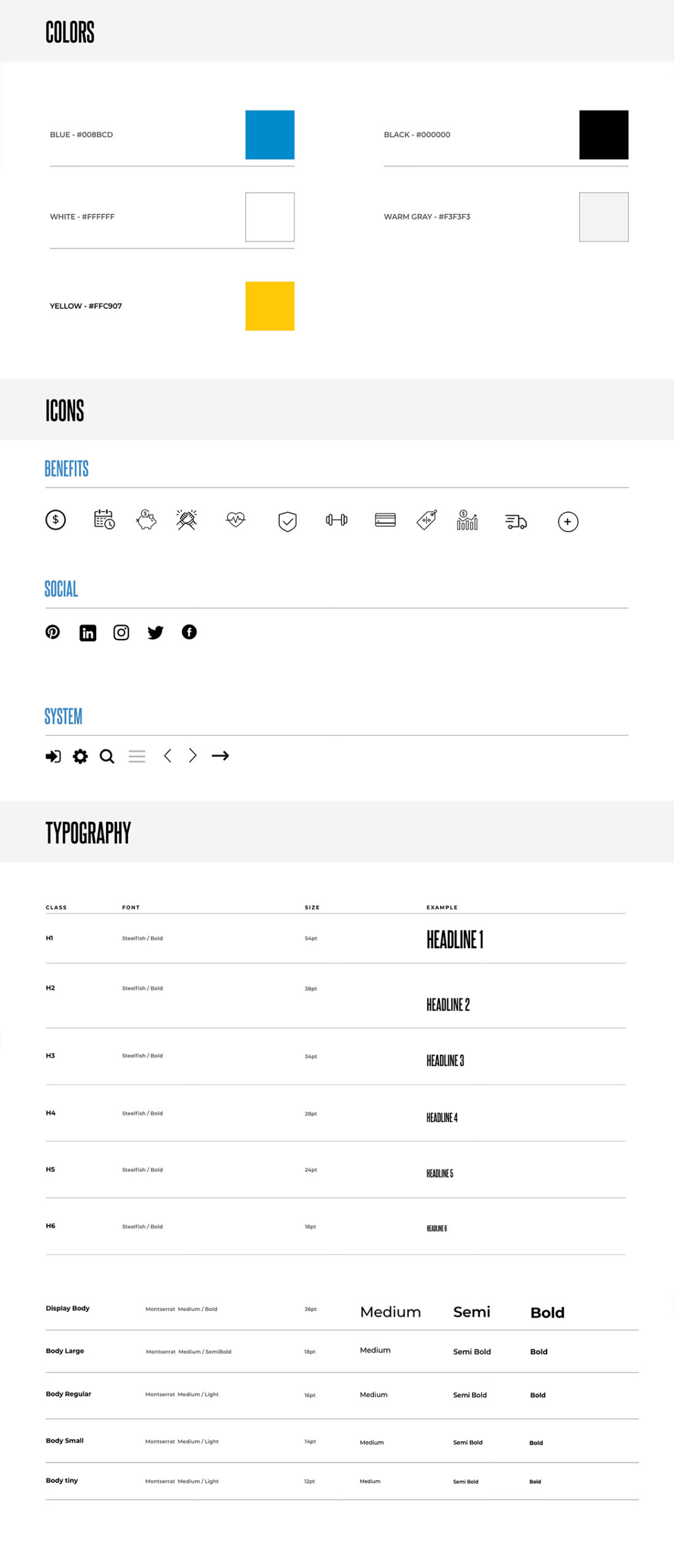
Colors, Fonts and Icons
The next step was to create the design system for the website. We decided to get inspiration from the Shoe Carnival brand.
Final Designs:
Starting from the pain point, these are the finished designs with new features and improved user experience.
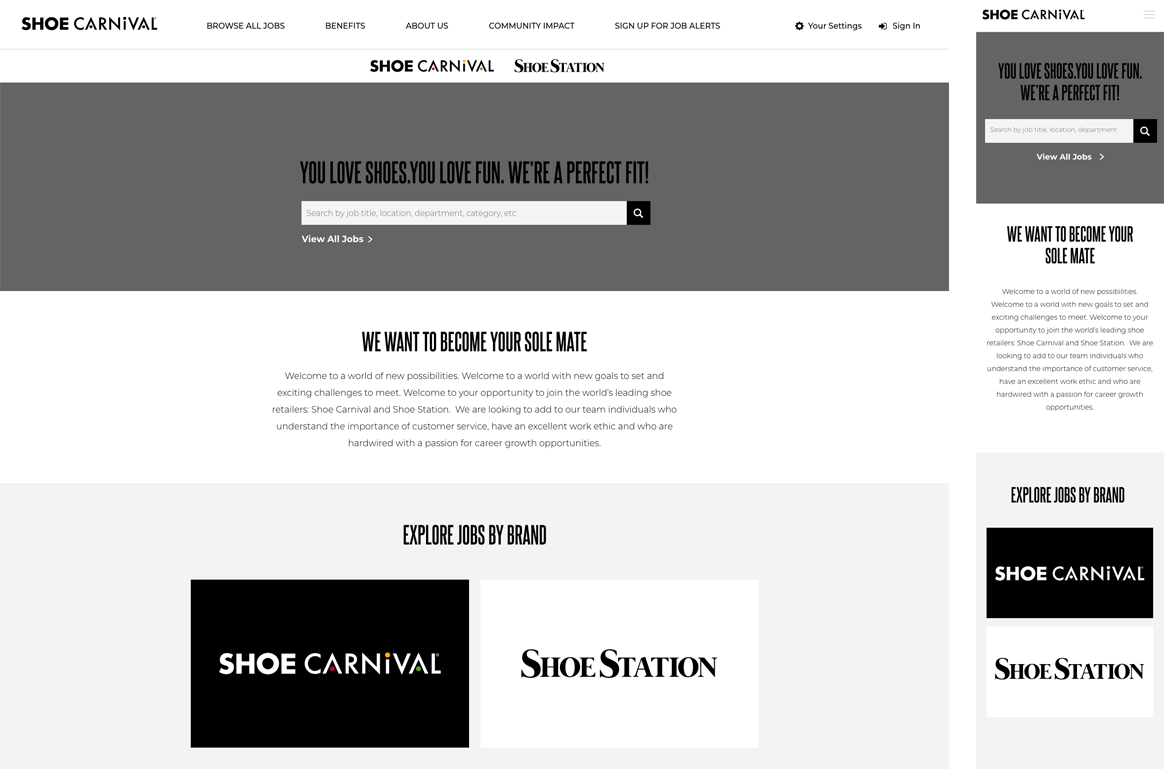
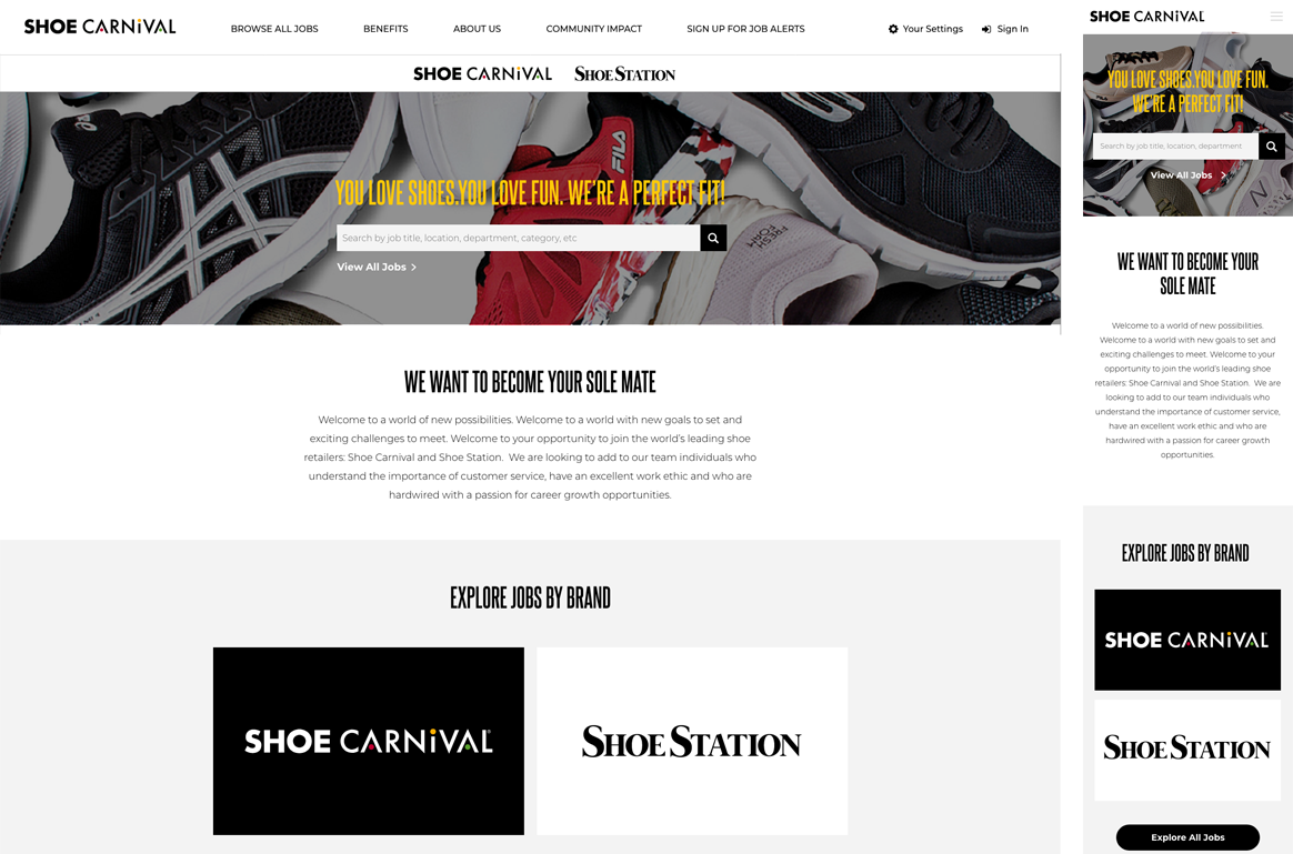
Homepage:
Giving the audience the ability to find what they needed was imperative for this page, so we decided to give them the ability to find their job of choice first then tell them the story of the company.
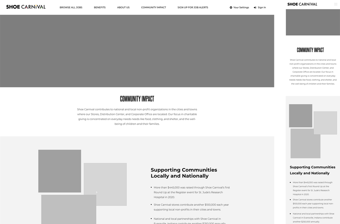
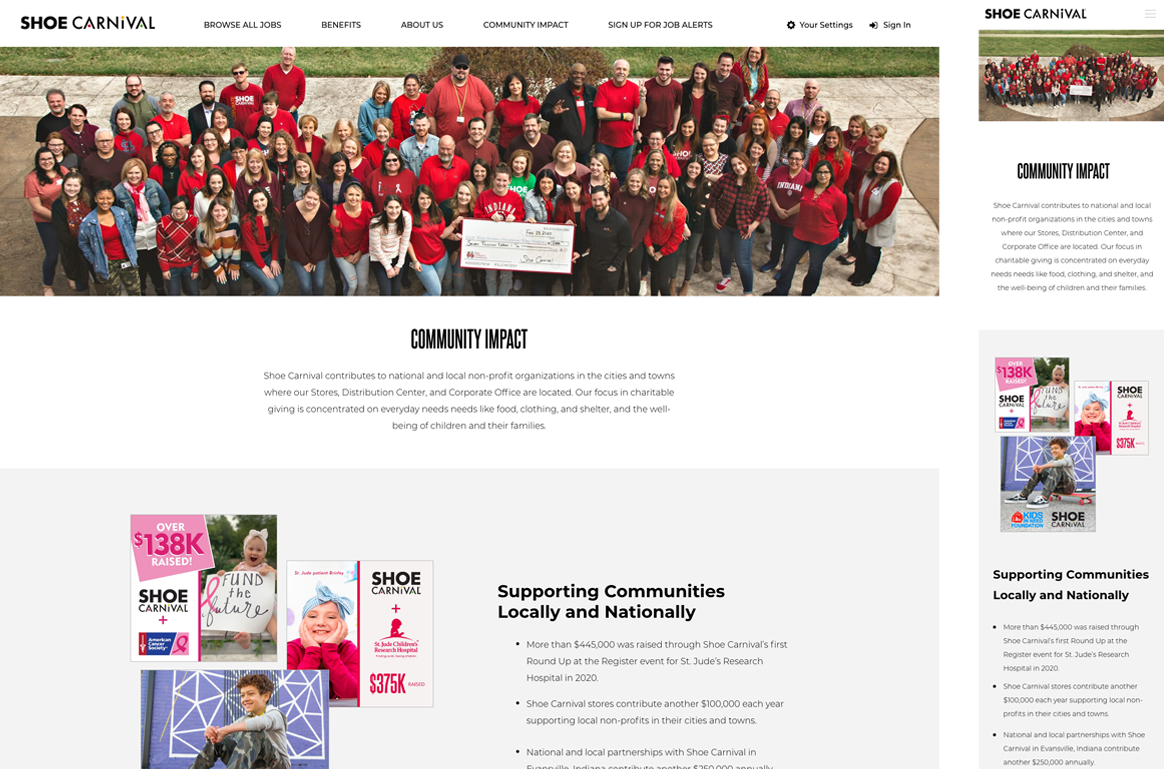
Content Pages:
We wanted to give a fun and exciting look for our internal pages to do this so we decided the best way to show this was through our photography. With a full time photography crew we were able to capture every moment of the employee.
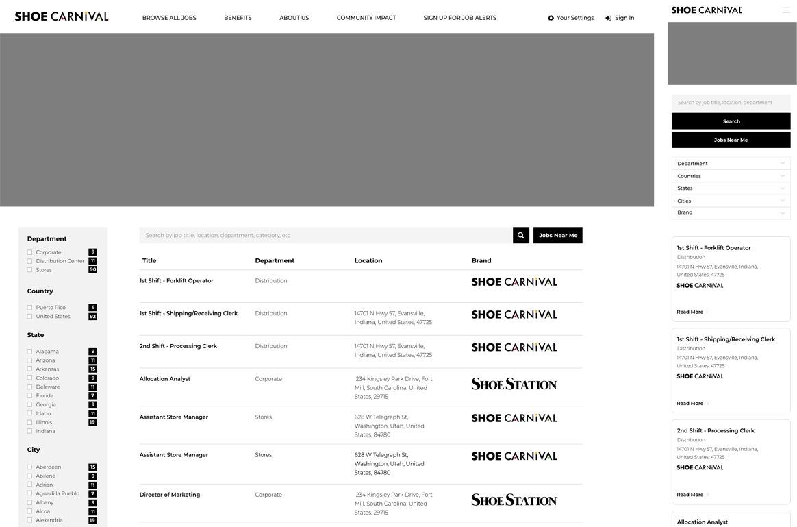
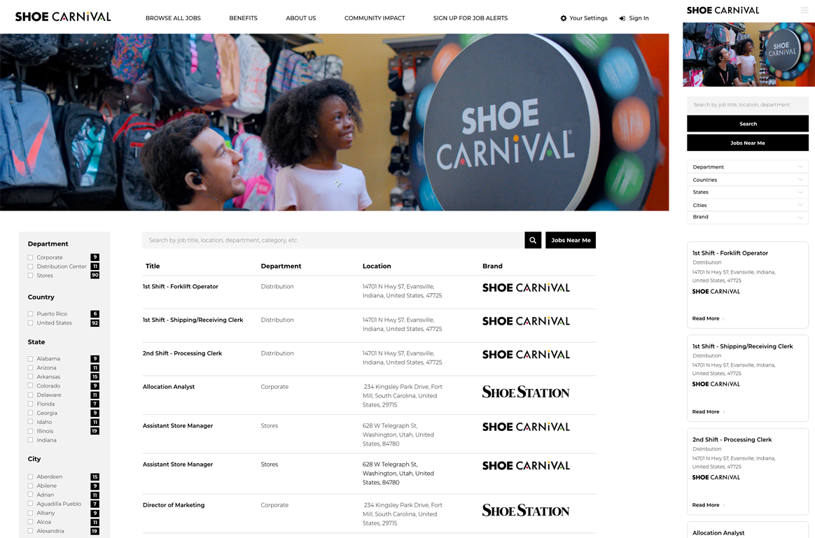
Job Search:
This was the most complex and most important part of the website. The goal for this page was to give the user the ability to find what they needed as quickly as possible. So what we decided to do was to treat this with giving the user as many options as possible to find what they need. This involved giving them a search bar to find their exact result as well as creating multiple filters for the user to break down what they need. Here is the concept we made:
The Results
Since releasing the new careers website user experience and performance has grown drastically. Time on page has grown 50% higher, which shows more people are engaged with the new content. We also saw a 40% increase in candidates becoming hired throughout the web experience.